City of Amnesia
May 17, 2024, 05:45:03 AM *
Welcome, Guest. Please login or register.

Login with username, password and session length
News:
 
   Home   Help Login Register  
Pages: [1]
  Print  
Author Topic: The Photoshop Projects  (Read 3312 times)
Char Aznable
"Pimp Char" (ref: Ace of Spades)
Global Moderator
Hero Member
*****
Offline Offline

Posts: 603


snakemarcato13


« on: February 18, 2011, 08:06:36 PM »

Here in school, I learned how to use photoshop. Wanting to display the fruits of my labors, I thought I'd make a thread for the sharing of personal photoshop projects.

We had to make a propaganda poster for an alien invasion. And yes, I made it grungy and a little worn-looking.

I'm actually really proud of that poster. And I have to make a final project that's better...

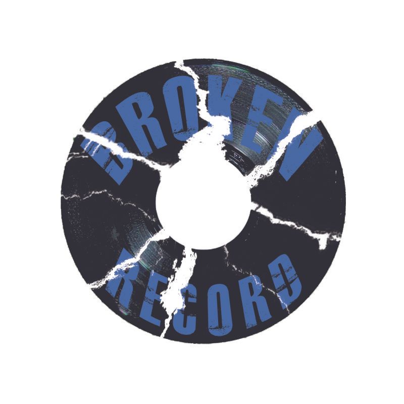
Then we had to make up a recording label and the logo.


EDIT: I've been getting told that the links aren't showing. Some people can see them and some can't. I'm going to try to fix that.
« Last Edit: February 18, 2011, 08:09:15 PM by Char Aznable » Logged


Hey Garma, do you read me? Blame this on the misfortune of your birth...nothing personal.
R. Daniel 01
Project Members
Hero Member
*
Offline Offline

Posts: 932


This machine has undergone numerous refinements.


WWW
« Reply #1 on: February 19, 2011, 08:29:22 PM »

They work for me.

The fallout poster is pretty sweet. However, I feel the text does not pop out enough. It probably needs some sort of border or feather.

The Broken Record needs something. Try increasing the contrast and adding more record fragments to make it more grungy. Right now, it's too simple. Underdeveloped.

Also, I feel like if you twisted the text around the center, rather than just skew the ends of the text box, it would look better.

Cool. Thanks for posting this stuff. I love discussing things like this on DeviantArt. Not so much in art classes, though.
Logged

Char Aznable
"Pimp Char" (ref: Ace of Spades)
Global Moderator
Hero Member
*****
Offline Offline

Posts: 603


snakemarcato13


« Reply #2 on: February 20, 2011, 01:26:50 AM »

They work for me at home but not at school, so it varies.

the text was done in InDesign by Jace after the rest of the poster was done, then added in later on photoshop as a layer.

The record logo...I was going for something kindof simple. My original plan was to bend it around the center, but I wanted to move on to the next project, so I went with more of a curve on the outside edges, which was an annoying adjustment.

My current project is a magasine cover and a two page spread, Lorem Ipsum text perfectly acceptable. I'm going to do a tuner mag. Teacher says it has to be better than anything else we've done, but I'm not sure how well I can outdo the fallout poster.
Logged


Hey Garma, do you read me? Blame this on the misfortune of your birth...nothing personal.
Pages: [1]
  Print  
 
Jump to:  

Powered by MySQL Powered by PHP Powered by SMF 1.1.21 | SMF © 2015, Simple Machines Valid XHTML 1.0! Valid CSS!