R. Daniel 01
Project Members
Hero Member

 Offline Offline
Posts: 932
This machine has undergone numerous refinements.

|
 |
« on: August 06, 2008, 10:34:31 PM » |
|
|
|
|
|
« Last Edit: September 13, 2008, 11:54:40 PM by R. Daniel Olk 01 »
|
 Logged
|
|
|
|
|
paul1290
|
|
« Reply #1 on: August 07, 2008, 02:21:49 PM » |
|
Interesting.
Facial expression is a tad creepy, but I guess it's supposed to be.
|
|
|
|
|
Logged
|
|
|
|
R. Daniel 01
Project Members
Hero Member
Offline
Posts: 932
This machine has undergone numerous refinements.
|
|
« Reply #2 on: August 07, 2008, 04:58:05 PM » |
|
Heh, oops. This ought to go in Room 24.
|
|
|
|
|
Logged
|
|
|
|
lin_hikaru_7
<can i buy roger smith at a flea market?>
Newbie
Offline
Posts: 9
<i mean, he is a louse>
|
|
« Reply #3 on: August 07, 2008, 09:50:07 PM » |
|
This is vector right?
Man, the pose and proportions are just off enough in realism to make it a really convincing picture of a humanoid machine. It's really good. The face is kind of creepy, but I always kind of like the expressionless statue sort of thing.
Good good job!
|
|
|
|
|
Logged
|
あなた が トマト です!
゚Д゚
|
|
|
R. Daniel 01
Project Members
Hero Member
Offline
Posts: 932
This machine has undergone numerous refinements.
|
|
« Reply #4 on: August 07, 2008, 10:23:28 PM » |
|
This is vector right?
Hmm. I used the pen tool for some of the curves and straight lines, to make sure they were perfect. All the shading and most of the lines were done by the stylus in mah hand, though. Pose is off, you say... I'm glad you said that. Somebody else said that the legs were a bit weird. I've made them thinner and fixed the knees since I posted this. Proportions off, also... you mean the arms? I, too, like the arms a bit long and lanky. Having things be a little off can be interesting if done right. Good good job! Thank you much. |
|
|
|
|
Logged
|
|
|
|
|
Bllue
|
|
« Reply #5 on: August 11, 2008, 05:30:47 AM » |
|
this is sooo IB Art, you don't even wanna know.
i envy those with superb control over their apendages...>_>
the highlighting is worthy of being stolen copied admired by me.
|
|
|
|
|
Logged
|
 Ninomiya sucks at dancing, but everything else is perfect......  |
|
|
R. Daniel 01
Project Members
Hero Member
Offline
Posts: 932
This machine has undergone numerous refinements.
|
|
« Reply #6 on: August 11, 2008, 07:32:40 PM » |
|
Ooh hoo hoo, you are impressed by that? You gots to up your standards, girl, because now it looks like this: 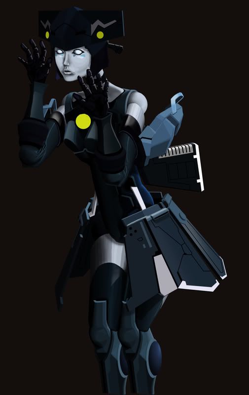 And this is the current state of the entire scene: 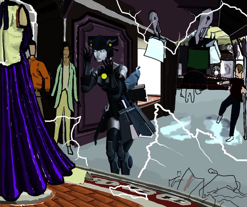 |
|
|
|
|
Logged
|
|
|
|
|
Bllue
|
|
« Reply #7 on: September 04, 2008, 02:48:52 AM » |
|
NO you n00bcake! I was impressed by the SHADING. gosh, read! I take back what i said about controlling appendages, my elementary school-aged brother controls a drawing pad better! *hmph* you obviously wanted to be insulted. What did you do use, a drawing pad or a mouse? You also obviously don't know what IB art is, either. Sorry, I'm being mean...  |
|
|
|
|
Logged
|
Ninomiya sucks at dancing, but everything else is perfect...... |
|
|
R. Daniel 01
Project Members
Hero Member
Offline
Posts: 932
This machine has undergone numerous refinements.
|
|
« Reply #8 on: September 04, 2008, 12:34:41 PM » |
|
Wow. You should do something about these outbursts of yours. This isn't the first time. I take back what i said about controlling appendages, my elementary school-aged brother controls a drawing pad better!
*hmph* you obviously wanted to be insulted. Well, I was planning on just linking to a Deviant Art page once I finished, but now I must defend my honor by showing its current status.  You also obviously don't know what IB art is, either. No, I don't really know what IB art is, and I doubt it matters. I looked it up and it seems to be some high school thing, where you get hard assignments like college students have. What did you do use, a drawing pad or a mouse? I use both a mouse and a pen. The mouse is good for laying out points and lines but not for curves. I was impressed by the SHADING. gosh, read! You didn't look carefully enough, because the shading on the second android is better than that of the first android. That's why I posted it. |
|
|
|
|
Logged
|
|
|
|
|
Bllue
|
|
« Reply #9 on: September 05, 2008, 01:17:30 AM » |
|
there wasn't a second android when i was impressed by the shading the first time. IB art is harder than college art, but its more about thinking out of the box and incorporating the world into art. i apologized for being mean... |
|
|
|
|
Logged
|
Ninomiya sucks at dancing, but everything else is perfect...... |
|
|
|
The Big Finale
|
|
« Reply #10 on: September 05, 2008, 08:22:39 PM » |
|
Regardless of your apology, Bllue - which to be entirely truthful, wasn't much of one at all - that was uncalled for and exceptionally rude. Please put a little more effort into not doing it again.
|
|
|
|
|
Logged
|
|
|
|
|
Bllue
|
|
« Reply #11 on: September 06, 2008, 11:09:47 PM » |
|
You are right. I do apologize. for being rude and forcing a moderator to talk to me...  Sorry, really. Any way, what program do you use? *gasp* I just now understood the title of the piece! *smacks head* And I was wondering why shopping bags were floating.  |
|
|
|
|
Logged
|
Ninomiya sucks at dancing, but everything else is perfect...... |
|
|
R. Daniel 01
Project Members
Hero Member
Offline
Posts: 932
This machine has undergone numerous refinements.
|
|
« Reply #12 on: September 07, 2008, 02:32:29 AM » |
|
Photoshop CS3. That's it.
|
|
|
|
|
Logged
|
|
|
|
6moondance
Project Members
Full Member
Offline
Posts: 126
|
|
« Reply #13 on: September 08, 2008, 05:34:53 PM » |
|
I'm intrigued by the difference in style between the humans and the android. The android is all sharply defined lines and clear, almost metallic colors while the humans are painted in a softer, more expressionistic style. I also like the expression on the android's face. There are definite stirrings of femininity and curiosity in her face.
|
|
|
|
|
Logged
|
|
|
|
R. Daniel 01
Project Members
Hero Member
Offline
Posts: 932
This machine has undergone numerous refinements.
|
|
« Reply #14 on: September 13, 2008, 11:51:57 PM » |
|
I'm intrigued by the difference in style between the humans and the android. The android is all sharply defined lines and clear, almost metallic colors while the humans are painted in a softer, more expressionistic style.
Heh. Chalk that up to seeing lots of anime where they do the same thing. I think it's a wise stylistic choice. Anyway, it is finally done. Here is the picture itself, followed by a link to my new DevArt. I trust I'm not the only one here who has one.  Android Shopping Spree on DA. Android Shopping Spree on DA. |
|
|
|
|
Logged
|
|
|
|
|


